An average week of working on a page for the comic consists of many hours of planning and sketching out the page’s look before committing to a final design and starting it. The beginning of the week is going into my plan-out paper on Google Docs and writing down a rough draft of what I want the page to look like. This includes the character(s) making certain gestures or saying specific dialogue. As well as what is going on around the character(s) to help the viewer understand the emotion of the scene. The time frame that this takes can be anywhere from 5 minutes to a whole day. Even though it takes me a long time to choose what I want to be portrayed in each scene, I still end up changing pieces of the original plan.
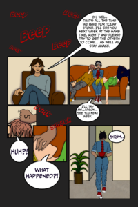
For example, on Page 15 of the comic, I completely reworked the format of the page. The original plan was to have six panels instead of five. The first two would be the same, but the next two would have been about six times their size. This would have resulted in a lot of unneeded background space, so instead, I decided to just do a close-up of the original sketch so that you have an easier time understanding what the larger picture would have had a difficult time showing. The last two panels would have been a close-up of all of their legs walking out of the door; just separated into one was the person walking out, as they are in full body on the last panel, and the other two who were sleeping were rushing after them.
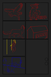
The next day starts with the sketchup of the page. This is where I start to design what the page is going to look like. Including the colors and the position of the “camera”. I will also sketch the full objects, even if another object of character is blocking part of them, so I can see if any of that needs to be adjusted. I have also learned that color-coding each different thing makes it easier to understand what is happening, so you don’t see parts of the sketch and get confused about what part goes to. The photo on the right is the complete sketchup of page 16.
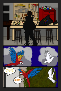
The third day is usually used to get the line work done. Depending on the complexity of the background, that can bleed into day four. Page 17 on the left is a great example of that. That whole page took almost two whole days to finish. I knew going into the design that the first panel was going to take a very long time to finish, so I did the last two first. As for the pages that don’t take too long, day four is all about color.
Getting all of the base colors done so that the last day of the week can be on track. The fifth and final day of the week is lighting and speech bubbles. What is the light source? Is it the sun, the moon, or a desk light at night? Is it overhead, in front, behind, or under the person, people, or object(s)? What direction is the shadow going to be projected based on the angle? All of these questions and more are what I have to take into account when it comes to every panel. Even if you can barely see it, every single object and person has a shadow, which has to be taken into account when it comes to lighting.
I haven’t been alone in figuring out what exactly needs adjustment or help with colors when it comes to scenes. I have been getting lots of help from Sally Francis, a cartoon artist and animator. She has been a huge help during this time. She’s helped me with drawing out panels and coloring panels. She’s also given me lots of constructive criticism about pages and has helped me improve the pages and improve on what I was struggling with, as well as some pointers to things I hadn’t even thought about. Sally also mentioned that keeping the details in the foreground and midground will help keep the viewer’s gaze where you want it to go. And to keep simple shapes in the background.
I looked into this more, and it is supposed to make the viewer disinterested in what is happening outside of the dialogue you want them to focus on. When it came to bettering the color contrast between the background and the character(s) or Object that is meant to be the focus of the panel Warm colors are a natural eye-catcher. The brain makes it a priority to look for and focus on warm colors in an image. However, I am trying to find ways to put the focus on a character that wears lots of cool colors like blues, purples, and blacks. I am working on ways to add warm-colored accents to grab the eye of the viewer. Right now, I am stuck between making the jewelry. This character wears gold instead of silver to see if that helps the scene. I genuinely don’t think that the pages that I have been working on over my Co-Op would have ended up the way they did without all the help that she has given me so far in the term, and I can’t wait to look back on the improvements in the next five weeks and see how much has changed with getting help and learning from Sally. If you want to read the ongoing comic, you can check it out for free on Webtoon and Tapas.

